The Dashboard is the home page of the Matcher module. It provides an at-a-glance overview of your reconciliation health for the selected context, covering key metrics, trend charts, breakdown visualizations, and recent reconciliation runs.Documentation Index
Fetch the complete documentation index at: https://docs.lerian.studio/llms.txt
Use this file to discover all available pages before exploring further.
Accessing the Dashboard
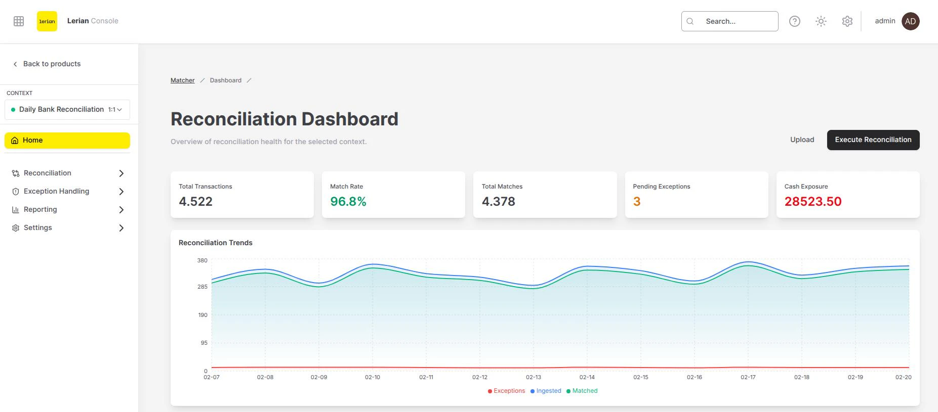
Navigate to Matcher → Dashboard in the left sidebar, or select Matcher from the product launcher — the Dashboard is the default landing page. All data displayed on the Dashboard is filtered by the active context selected in the Context Switcher and defaults to the last 30 days.
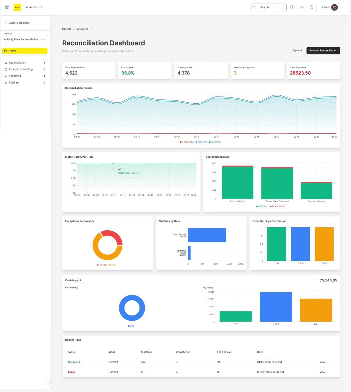
KPI cards
A row of five summary cards appears at the top of the page:
| Card | Description |
|---|---|
| Total Transactions | Total number of transactions ingested across all sources in the selected period. |
| Match Rate | Percentage of transactions that were successfully matched. Displayed in green for quick assessment. |
| Total Matches | Absolute count of confirmed match groups created during the period. |
| Pending Exceptions | Number of exceptions still awaiting resolution. Highlighted in amber when non-zero. |
| Cash Exposure | Aggregate monetary value of unmatched transactions flagged as critical. Highlighted in red. |
Charts
Below the KPI cards, the Dashboard presents several interactive charts that help you identify patterns and spot issues.
Reconciliation Trends
A full-width area chart showing daily volumes over the selected period. Three series are plotted:- Ingested — number of transactions ingested per day.
- Matched — number of transactions matched per day.
- Exceptions — number of exceptions generated per day.
Match Rate Over Time
An area chart displaying the daily match rate percentage (0–100%). Monitor this chart for downward trends that may indicate rule degradation or data quality issues.Source Breakdown
A stacked bar chart showing matched vs. unmatched transaction counts per source. Use it to identify which sources contribute the most unmatched items.Exceptions by Severity
A donut chart breaking down open exceptions by severity level:- Critical — requires immediate attention.
- High — should be resolved promptly.
- Medium — standard priority.
- Low — informational or minor discrepancies.
Matches by Rule
A horizontal bar chart ranking match rules by the number of matches they produced. Helps you understand which rules are most active and whether rule coverage is balanced.Exception Age Distribution
A bar chart grouping open exceptions by age bucket (for example, 0–1 days, 2–7 days, 8–30 days). Aging exceptions may indicate bottlenecks in your resolution workflow.Cash Impact
A dedicated section displaying the total unmatched monetary amount with two sub-charts:- By Currency — a donut chart showing unmatched amounts broken down by currency.
- By Aging — a bar chart showing unmatched amounts grouped by age bucket.
Recent Runs
At the bottom of the page, a table lists the most recent reconciliation runs for the selected context. Columns include:
| Column | Description |
|---|---|
| Status | Current state of the run: Queued, Processing, Completed, or Failed. |
| Mode | Whether the run was a Dry Run (preview only) or Commit (results persisted). |
| Matches | Number of match groups created. |
| Unmatched | Combined count of unmatched transactions from both sides. |
| For Review | Transactions flagged for manual review. |
| Date | Timestamp when the run started. |
| View | Link to open the run details in the Matches page. |
Action buttons
The page header includes two action buttons:
- Upload — opens the file upload flow to ingest new transaction data.
- Execute Reconciliation — starts a new reconciliation run for the active context.